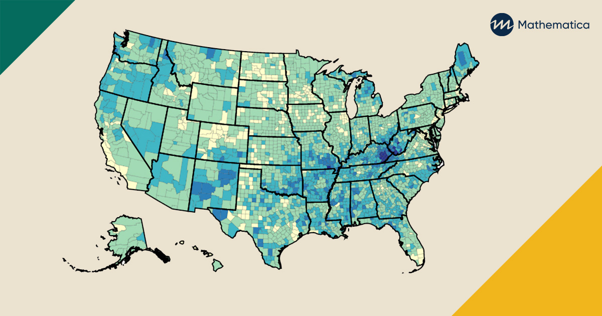
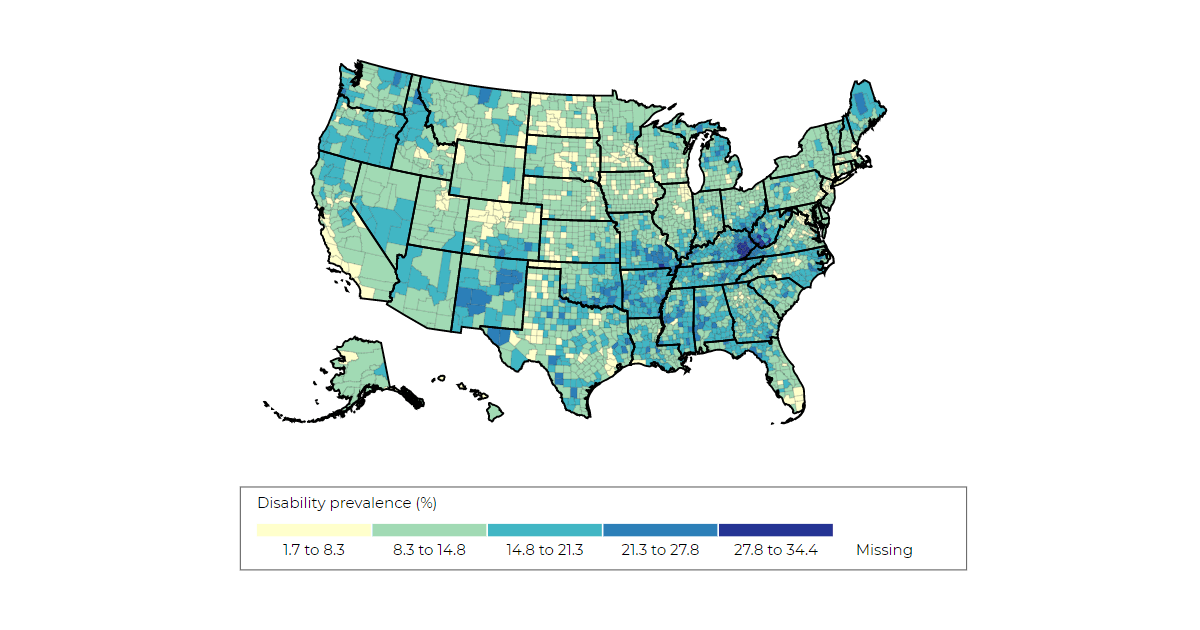
Visual aids such as interactive maps and dashboards can help illuminate vital insights that might otherwise be overlooked. These insights can help states and counties identify their progress and their unmet needs. To assist decision makers, Mathematica’s Center for Studying Disability Policy recently created interactive state disability maps that reveal important patterns in state- and county-level prevalence of disability among working-age adults across the United States as well as how that prevalence compares with Social Security Disability Insurance (DI) and Supplemental Security Income (SSI) participation rates. These maps show considerable variation in the prevalence of disability not just across states but also across counties within states. Participation rates of DI and SSI also vary, but they don’t perfectly overlap with rates of disability. This information can help policymakers and program managers better identify areas with the highest needs or potential benefit discrepancies so they can target assessments, outreach, services, and early interventions.
Insights include the following:
- New Jersey and Hawaii have the lowest prevalence of working-age people with disabilities at 8 percent, and West Virginia and Kentucky have the highest prevalence at 17 percent and 16 percent, respectively.
- Within-state variation in disability prevalence can be substantial; in Missouri, for example, disability prevalence ranges from a low of 8 percent in St. Charles County to a high of 29 percent in Ripley County.
- Although New Jersey has the lowest disability prevalence, other states have lower DI and SSI participation rates. New Jersey has the 9th lowest DI participation rate and 7th lowest SSI participation rate.
Data for the maps come from several sources. Staff from the University of New Hampshire Institute on Disability generated population statistics from the 2014 to 2018 American Community Survey five-year estimates. County-level SSI and DI program participation statistics came from 2018 data published by the Social Security Administration. In addition to the maps, the data are available for download to assist researchers, policymakers, and program managers with their own in-depth analysis.
Mathematica’s Yonatan Ben-Shalom and Gina Livermore discuss in a blog post the value of this resource and how it can help decision makers better serve people with disabilities.
Check out some of the other interactive maps that Mathematica has produced to illuminate trends and clarify vital information for state contact tracing efforts and student transitions from high school to college. Additional disability-related maps and resources will be coming soon.